It starts with getting the blues
We are colour addicts, and also seem colour illiterate. That sounds like a bad combination....
It is one of those subjects that everyone already knows about. So you cannot tell them something new. Yes, I know, they say. While clearly they do not. You are probably not that person because you are here, reading this first essay on colour.
I have sold colour for over twenty years, answering questions customers had. On paints, soft pastels, mixing, pigments, glazes. Often, art school graduates without even the most basic understanding. It shocked me. And the weird thing is that misunderstanding such an omnipresent phenomenon has a massive impact on society. But it is so up close, so basic and fundamental we forget to revisit it after the first round, back in kindergarten, or after getting how to mix a basic range from the primaries. Some may have acquired specialist knowledge of more depth, but colour is a huge field. There is always more. I know I can shock you, surprise you, change your view on this. And it could have quite the impact.
Goethe, wrote "zur Farbenlehre" and called it proudly his greatest achievement, he attacked Newton's "Opticks", calling it "an old nest of rats and owls." These two bickering white dudes represent two ways of looking at the world. A parting of ways with disastrous results. More than anything, it is our disagreeing on colour theory that caused that split. It turns out both were right, and both were wrong.
We're making a big swoop here, no details yet. Just putting colour back on the throne. Because it was royalty, and 'the church' that wanted more intense and permanent colour to distinguish their specialness, their right to be right. For that, we started, I say we, because the Dutch were leading the way, in the search for reds and purples, bright ones, lasting ones. We sailed the seas to find them. Went further than the Venetians. And we found spices and coffee and rubber, and slaves, and investment banking. Yes and colour too, the initial reason for colonising, for starting the whole damn thing.
Another highlight in history, is the competition to reach the next level in the colour trade. Organic colours, sounds great, huh? But by that, the pigment trade means synthetics. Chemical wizardry. Yes, of carbon origin, but as far as you can get from the kind of organic now in demand. Contrary to the anorganics, that are of mineral or metal origin. The race was on between France and Germany to find a blue. A replacement for the costly Lapis Lazuli found in faraway Afghan mines. And very labour-intensive to refine into a good blue. The finest quality is still more expensive per pound than gold.
A german discovered a strong blue accidentally in 1706. Berlin blue or Prussian blue is one of the strongest pigments but it has a greenish undertone, not suited for the holy purple. Scheisse.
Again, it was Goethe who tipped off the French with a way to find synthetic ultramarine. And guess who won the race with making French Ultramarine1? Finally a cheap blue with a red tendency. They tried to keep the recipe secret. But the german competition succeeded two years later and made the method public. Opening the doors to synthetic organic molecules in need of patenting.
Why? Because colour and the production of goods have a deep bond. Pigments are not just for artists and paintings. Also for dyeing fabrics and leather, glazing ceramics and printing to name a few. Nowadays, almost every product involves pigments and knowledge of colour, including food and cosmetics. Our culture relies heavily on how things look. Surface, skin, packaging, image.
The bulk of those colours, come from a few companies. Bayer2 being the biggest, yes the one responsible for vitamins, poisons, heroin, and medicines, also provides most of the colour. The same bunch and their colleagues who brightened up the first world war with cheaply produced chemicals (skin care), and repeated the show with the follow-up. Our colourful world is built on the same expertise that also gave us Zyklon B, a sort of round-up for humans3. And they are still in business. The chemists. The owners of the molecules. No signs that they are done yet. No clear declaration they won't provide a third round with whatever is in demand. No Substack riot on their sneaky hostile takeovers.
All this to show colour is deep. And we are deep into colour. Time to learn more about it, I think. Not just the rich history, or practical advice, but more —as you may expect from me— a connecting of the dots to sketch a panoramic understanding of one of the strangest things we take totally for granted; light.
Because colour and light are one and the same. Understanding light, that is a great goal for more than one bit of writing, isn't it? We are colour addicts, while most humans also seem colour illiterate. That sounds like a bad combination....
One example from the shop floor.
An often asked question.
"Do you have skin colour?"
Painters, doing a portrait or a nude, came to buy a tube for that purpose. And most ranges have. A pinkish beige suitable for dolls. Something we (used to) call white skin. Which isn't white at all. And not one pre-mixed colour. It is also not pure in any sense. Or better than, or capable of providing information on personality, opinions, intelligence, value. I feel shame, thinking back. Skin colour. Morons.
So, if I now ask you what colour your skin is, can you give me a better answer? The only acceptable answer? If not, I expect to see you next week. Same time, same place...
A strange little festival in the 1950's inspires a picture book and it will take a hundred years before its full reach becomes clear. Be careful with what you draw.
Excerpt from the diary of Season 3:
I'm ready to go. Didn't sleep. Finally it becomes light. I'm afraid. Once again I step out of my safety. That is unwise. I am unwise. That's exactly what I have to do. That's exactly what I don't want. I'm not ready to go at all. A bike ride of a thousand kilometers requires preparation. Not just inner urge. Not just a bike with potential. Purpleness doesn't matter, bicycle-bags do. And food, money, rain-gear. And I need to take what I don't want to leave behind. I'm standing at my drawing table crying. The smooth door on the dressers has served me well. How many hours have I sat under the dirty block window? How long is the line of ink that has flowed from my scratchy pens? How many colours did I layer on top of each other? Flow, I have to flow, every day. How is that possible on the road? Where do I leave what comes next? What comes next if I leave?
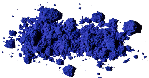
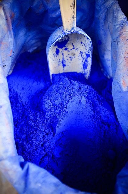
French Ultramarine is the pigment makers dream. Cheap to make and very versatile. A bucket of pure Ultramarine blue pigment almost hurts your eyes. One of the most intense colours I have seen. A tiny bit of it was sold as whitener for doing laundry. It made yellowing cotton appear more white, more clean. Just optical, not really. And it makes the best purples, and for that reason it is sold as a primary colour. Which is bulshit, but more on that in another post.
Bayer. One of the biggest pharmaceutical companies started out as a dyestuffs producer. Farbenfabrik. A colour factory. Soon to be expanded with for example heroin, an over the counter product until the 1920’s. Made big by Bayer. The tendency to produce things that create a high dependency, on a scary wide scale should get a lot more attention. Yes, the happy bright shades have a very dark history. And we aren’t even aware being addicted in many cases. This next century, might be a lot less bright than the twentieth was, because of that.
Roundup for humans? Quite harsh to say, I know. But to me it seems the same pattern is tried over and over again. The difference with killing weeds (unwanted plants) killing vermin (unwanted animals) or killing unwanted humans with a convenient shower product is less big than you might assume. Exposing a way of thinking deeply engrained in all of western society. So, not here to blame Bayer, or Monsanto, or Germans, or even Americans for that matter. But I will go for a brutally honest look at our own colour palette. Yours and mine. It starts with getting the blues…..but it won't end there. Hope to see you next week. Don't forget to appreciate…..


What a fascinating read. You’ve led me to need to learn more about the connection between color and colonization.
As a one time artist I know the cost of pigments. I am willing to pay a premium for certain color - watercolor and inks in particular.
Thank you for opening this door for me.
Thank you so much for this excellent introduction. In Portugal (where I live) we can buy colour pigments by weight ~ including the ultramarine blue powder, which looks just like the one on your photo. (we mix the pigments with lime to make wall paint. Much cheaper and better than the chemical shit they sell for a lot of money in tins)